Plotting event-related data
under construction)Plotting interval data
To start plotting select the study folder you wish to work with. Next, load a batchfile that containes the filepaths of all the raw data files, that you wish to create plots of (you can create such a batchfile using the create batchfile-tool in the file menu). Then, choose 'batch plotting (mat)' from ANSLAB tools menu. You are then given a set of choices, that allow you specify the exact type of plot you want to create.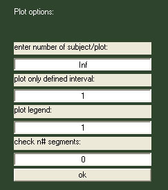 :
:
Each option will be described in the
following:
Number of subjects/plot:
This value corresponds the number of lines ANSLAB will plot in one axis before printing the axis to an image file. Entering '1' will result in one image per subject, entering 'inf' will result in one plot containing all files in the batch. Moreover, as it is a common task to have both, the single subject plot and the plot of the entire sample, entering 'inf' will also create the single subject plots in addition to the overview plot. If you do not need the single subject plots, enter the number of files in your batch as an integer number.Plot only defined interval:
If on, ANSLAB reads the associated timing file and plots only data that lies between the begin of the first and the end of the last defined interval.Plot legend:
If on, a legend is added to the plot with filenames - linecolor associations.Check n# segments:
If on, ANSLAB checks the contents of associated timing files for equal number of defined segments.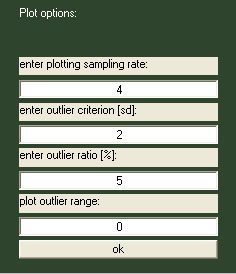
Plotting sampling rate:
Data of different channels is resampled to the given resolution. As most extracted traces are saved with 4Hz sampling rate, 4 will leave most data unchanged.Outlier criterion [sd]:
Number of standard deviations distance from mean defining outlier range.Outlier ratio [%]:
Percentage of values, that have to be outside outlier range to qualify the file to be listed in the legend.Plot outlier range[1 = on, 0 = off]:
If on, a red line and a grey range are plotted for mean and outlier range. Only outlier files are plotted on top.The example below is a plot of 65 ecg data files, plotting only defined intervals were activated, which can be seen as data lengths match nicely across files. Only outlier files are listed in the legend, plotting the outlier range was deactivated.

The next example is the first part of the single subject plots created for the same files (always ibi in the first axis, and twa in the second): it is one large jpeg-file, with plots vertically connected to a series. You can quickly scan such a plot using any fast image viewer or a browser.
